Basic Accessibility Guidelines
Build accessibility in from the beginning.
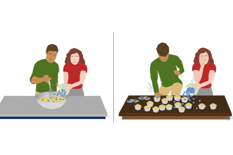
Inclusive designer Brian Parsons created a graphic back in 2020 to help people better understand why it makes sense to build accessibility into every project from the beginning.
- In the left panel, you have two people making blueberry muffins by pouring the blueberries into a bowl of muffin batter. This represents adding accessibility at the beginning of a project.
- In the right panel, you have the same two people trying to make blueberry muffins by smashing the blueberries into the baked muffins. There are blueberries on the counter, and exploded atop the muffins. This represents trying to add accessibility at the end of a project.
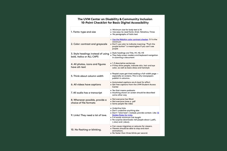
10 Basic Principles of Digital Accessibility
- Minimum size for body text should be 14 points or larger. Ask you audience for feedback.
- Use easy-to-read fonts. These are: Arial, Helvetica, Verdana, Calibri, or Times new Roman.
- No paragraphs of italic text. Italic text should be used to emphasize words or short sentences, but can be really difficult to read as a paragraph.
- Use the WebAim color contrast checker. 3:1 should be the minimum color contrast for large text, icons, and graphics. For smaller text, like body text, bump it up to 4.75:1.
- Don’t use color to indicate meaning. “Push the purple button to get in touch” is meaningless if you can’t see purple.
- Test your designs in grayscale. Some people can’t see color at all, and still need your information. If you’re on a Mac, use the “Color Filters” accessibility tool to review, or upload your document to the Toptal color-blindness simulator.
- Headings are Title, H1, H2, H3. You use these instead of simply making the title of a page, section, or paragraph larger, or bolding it.
- They help screen readers and keyboard navigation in scanning a document.
- You can still bold or italicize your headings — as long as they also have heading markup (Title, H1, H2, H3, etc).
- Headings should also follow in logical numeric order:
- Title of your page should be H1. After that, section headings are H2. Within a section, your main topics are H3. Within a main topic your subtopics are H4.
- If you need more than H6, go back and look at how you’re breaking up your information.
- Page and document titles are generally laid out as H1.
- All photos, icons, and figures should either have alt-text, or they should be marked decorative.
- Alt-text should be 1-3 descriptive sentences. Focus on the main point of the image. You don’t need to describe the color of the flowers on the wallpaper — unless you’re creating an ad for wallpaper. You do need to describe how many people are in the image, who they are, and what they’re doing.
- If your image shows people, indicate skin, hair and eye color. Also consider basic dress and hairstyle.
- Haben Girma describes how important it is that alt-text includes BIPOC people (video).
- Don’t be afraid to include color terms. Many blind and low-vision people appreciate being told about colors, such as “dark green forests” or “woodpecker with vibrant orange wings”.
- Try to use columns whenever practical. People’s eyes get tired reading a full-width page — especially on screens. This is why newspapers publish in columns.
- Do not justify your text to both sides of the page. Left-justify any text written in a language that reads left-to-right.
- Right-justify text in languages that read right-to-left, such as Hebrew.
- All videos need captions.
- You should be able to turn captions on and off.
- Use the captioning functions of whatever platform you’re on. For instance, on YouTube, you can upload captions for every video. So you should upload captions for every video. If you use their tool this way, the captions can be accessed by screen readers.
- Automated captions are only 70% accurate, on average. They are still better than nothing.
- Edited captions are kindness. And if you’re posting a video on YouTube, they’ll help your search-engine optimization (SEO).
- All podcast episodes need transcripts.
- Yes, even short ones.
- Automated transcripts are better than nothing. But edited transcripts are not only better accessibility, they too will help boost your search-engine optimization. Help people find and access your content!
- Not everyone has Microsoft Word.
- Not everyone loves a .pdf. And .pdfs are frequently inaccessible unless you spend time ensuring full accessibility.
- Webpages should be included as a choice. Lots of people have installed browsers, browser settings, and/or stylesheets that help them with reading and consuming webpages.
- Some people like video, some people cannot stand it. All video should have a text alternative.
- Underline links. Don’t underline any other text for emphasis.
- Link text should be a different color than body text. Try to avoid making other text a random color for emphasis.
- Don’t say “click here”. Instead, provide context. Like: 15 Golden Rules for Links.
- 3-4 words minimum link length. This helps people who have limited mobility in their fingers, hands, and wrists have a larger target to aim for.
- No surprise downloads. All links are assumed to go to webpages unless you say otherwise. Tell people about (.pdf), (.xlsx) and (.docx).
- Flashing and blinking items, such as animations, can cause migraines or seizures for some viewers.
- Viewers should be able to stop and start animations. Nothing you include — animations, videos, audio, ads — should be set to auto-play.
- Absolutely nothing that moves faster than three blinks per second. This is the generally accepted threshold for causing seizures and migraines.
Download our 10-point checklist as a .pdf
Need a quick reference sheet to help with basic accessibility? You can download and print our 10 Basic Principles of Digital Accessibility and keep it close by.

Some useful statistics about accessibility & disability
As of 2022, the US Center for Disease Control estimates that more than 1 in 4 people in the United States has at least one disability. That’s more than 70 million people in the United States.
Here in Vermont, more than 129,000 adults reported having at least one disability.
In Vermont, the most common disability type was cognition: 13% of adults in Vermont reported having a cognitive disability. The next most common disability type was mobility. And 9% of adults in Vermont reported having a mobility issue.
- 67% of all accessibility issues are due to choices made by designers and creators. (Source: Deque.com)
- 87% of organizations who responded to the Level Access State of Digital Accessibility Report in 2022 reported that their overall performance had improved as a result of working on their digital accessibility.
- 61% of those same organizations reported an increase in revenue after improving their digital accessibility.
- 68% of organizations undertake improvements in digital accessibility in order to benefit everyone they serve.